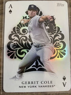
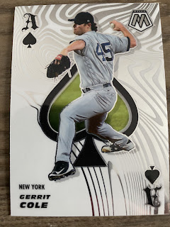
Last week I mentioned how I was chasing the 2023 Topps Aces set and how much I liked the design. However, I think a lot of us forget that Select had this design back in the 90's. So, a lot of re-use on it. Panini had done it most recent in a Pinnacle product and in their Donruss/Optic products before Topps jumped on board this year.
With that in mind, I am asking you, which company did their Aces insert better? Yes, I am excluding Select because nothing beats an original.
Topps?
Panini?
And let me know in comments which you think did it better and why. Also, try not to use the MLB logo aspect as your reasoning for not choosing Panini. I want you to think strictly design.
In my opinion, I like the Topps design slightly better due to the fact I like the shine behind the player. I think it brings out the card more.
Now your thoughts!


Topps, though I am biased against anything Panini so grain of salt. Though the original 93 Select is better still to me.
ReplyDeleteI agree that Topps is better here, and the original is better, only because the set has Kevin Tapani on it: ).
ReplyDeleteI'll go with Panini. I like the more stylized "A" and I don't like Topps' overly designed spade behind the player.
ReplyDeleteI'm voting Topps. I think Panini would have been a lot better without the zebra stripes on the card.
ReplyDeleteI like Topps for the opposite reason Brett gave--I prefer the stylized spade. I also like the rounded playing card corners.
ReplyDelete